Thursday, January 31, 2008

2nd Artefact

Here is my second artefact, made in the same way as the last but with limitations from the SNES, which in this case isn't much of a limitation looking back on the last artefact.


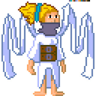
As you can see, it is much more detailed and colourful.

Here is an example of some of the stages i went through in tweaking the image, from making the neck smaller to altering the wings.

2nd Artefact Evaluation

I carried my pixel art on from my 1st artefact in the second one, but this time I based the specifications on the Super Nintendo Entertainment System, released in 1992 in Europe. Due to the advanced technology available to this system I could produce an image that was much bigger and allowed many more colours, the size I used was 64x64 pixels, and I was allowed to use a palette of 16 colours that I could choose from a possible 32,768 colours. Due to these more forgiving limitations, the image I created was much better looking, and even though a state of realism could not really be achieved within the space of 64x64 pixels, an artist could create an entity with lots of character. I don’t know how my research into whether computer game characters created with realistic modelling are less aesthetically pleasing will turn out at this time, but pixel art is still very popular today so that may sway peoples opinions. For this artefact I found that I could draw out the lines straight into Photoshop unlike the NES image where I had to carefully place each pixel for maximum effect. I followed tutorials online that suggested having an outline of 1 pixel thick, so I made sure to delete pixels that were grouped up in an ugly way, this gave me a good insight into making pixel images look good. I also had more space to create the ‘wing’ ribbons that were just a line in the NES image; everyone that I showed the NES image couldn’t make out what it was at first, but a few did think that they were wings. Due to this experience I realised like never before how great a leap the NES was to the SNES.
Character Sketches for Research Artefacts

I finally finished off some sketches, i really just wanted to make them presentable for my blog. So here goes.

This is the character I am using to base all my images on, she is based loosely on an angel but not in the traditional sense. I didn't finish the legs in this picture because they kept looking wrong, so i left them. In the right corner is a sketch of the head side on, to show the hair detail and the 'halo'.

These were the first sketches I did, and the idea hasn't changed a lot since then except maybe the addition of the 'wings' as the flowing ribbons.
Preliminary Designs for Final Artefact

No this isn't a mistake, I haven't got as far as the final artefact this soon, but I have decided to practice making a high polygon model as this is what the final artefact will be. I'm doing this because I don't have any experience at all in creating a body in a 3D program, so I bought this really handy book called "Maya 8 Character Modeling". I recommend this book to anyone who is interested in modeling bodies.

Update: Added nose to the face. Following the steps in the book made it quite simple, but i have yet to make it look presentable, which comes later in the book.

Update (01/02/08): I have finished the section on modeling the nose and the mouth, all I have to do now is neaten them up. Quite pleased with the results so far.

Tuesday, January 29, 2008

Client Project Proposal

Given Brief:

To create an original and playable first-person level in either the Unreal Runtime or UT2004 application to a high standard. Successful completion of the project will develop and hone skills in the following areas:

  • Demonstrable evidence of Level Design skills.
  • Demonstrable evidence of Architectural design skills and the use of architectural composition.
  • Demonstrable evidence of the ability of working to a strict technical brief.Demonstrable evidence of problem solving and adaptation from conception through to final product.
It is required that the level has stand alone texture and static-mesh packs (.UTX and .USX format).

There is also a requirement to include BOT/AI pathing in your level

You must choose one of the four following themes:
  • Gothic
  • Sci-fi
  • Cartoon
  • Contemporary
  1. The player must be able to spawn.
  2. There must be a lighting scheme.
  3. The level must successfully load into the Unreal Engine with no compiling errors.
  4. No more than 50 uniquely created diffuse colour textures may be used.
  5. All textures must be your own. (No reuse of UT tex packs is allowed.) Any static meshes used must be your own. No re-use of UT static meshes is permitted.
  6. Maximum individual texture size of 2048x2048 pixels.
  7. Polygon count for the entire level: Min: 30,000 triangles Max: 100,000 triangles.
Theme Choice:

I have chosen to create the level in the theme of Gothic Architecture, and the level will have an old horror movie quality about it. The level will be set in a mountainous area, but the actual playable portion of the level is a bridge that spans a bottomless chasm. This bridge is a huge, ornate bridge leading to Dracula’s castle, which players may be able to spot in the distance.

Description and Level Layout:

The bridge will not be like bridges you might find elsewhere in the world, it is more like a fortress that just happens to be the only way across this chasm leading to Dracula’s castle. In the middle of this bridge lies a huge cathedral style building with high vaulted roofs and a high spire situated on the top that can be used by players as a vantage point or sniper position. This spire can be got to in a number of different ways, such as stairs leading up the sides of the building and a number of walkways running around the roof of the building. At either end of the bridge lie tall towers, each with a pinnacle on top. These too can be used as vantage/sniper spots, and can be entered from below by various sets of stairs. The sides of the bridge are blocked off by walls to insure that players do not inadvertently fall to their doom, but along these walls lies doors that lead underneath the bridge to a network of rooms. These rooms connect to everywhere on the bridge, and span as wide as the reach both tall towers, this ensures that players have a number of routes to choose to get to their destination. Parts of the bridge have fallen prey to the elements, and due to disrepair have crumbled onto the floor. These bits of rubble have proven useful to players who wish to traverse the bridge unharmed, by using them as cover to stay hidden. Also due to villagers using the bridge to get to Dracula’s castle, and with the inevitable battle between Vampires and Humans that ensued, many tell tale signs of battle are apparent such as discarded wagons and debris.

Inspirations:

What first inspired me in the design of this level was an Internet search into Gothic Architecture, where a found a bridge in Prague that was built in the Gothic style. I then started thinking about how a long straight open level could be very detrimental to the players playing the map, so I tried to think of ways around it by breaking the level up a bit. I went back to the church architecture I was looking at recently and wondered about how it would look if I put a building in the middle of the bridge, and I remembered about Tower Bridge in London with its huge towers. If I used towers like this, but made it so that there weren’t as many open spaces in the level I thought it could definitely work, and if I had bits of architecture broken and on the floor of the bridge, like big columns of stone, I could give players cover from enemy fire.

Textures and Meshes:

For my level I will be using an abundance of stone textures for different parts of the level, so players can easily tell what part they are in, and textures for the roofs are needed as well. Ornate textures based on Gothic carvings will feature a lot in this level also, so I will have a few examples that I will carry on research into. Statues on the walls of the buildings will be made in Maya, as will windows and doors. The rubble on the floor of the bridge will also be made in Maya, as will the debris like wagons and barricades.

Time Management:

  • 28/01/08 – Hand in Proposal, carry on researching into Gothic Architecture.
  • 04/02/08 – Plan layout of level.
  • 11/02/08 – Start work in Unreal Editor.
  • 18/02/08 – Continue work in Unreal Editor, make use of Maya and Photoshop for meshes and textures.
  • 25/02/08 – Continue work in Unreal, Maya and Photoshop.
  • 03/03/08 – Continue work in Unreal, Maya and Photoshop.
  • 10/03/08 – Continue work in Unreal, Maya and Photoshop.
  • 17/03/08 – Continue work in Unreal, Maya and Photoshop. Start to lay out bot pathing.
  • 24/03/08 - Continue work in Unreal, Maya and Photoshop. Continue with bot pathing, and regularly play test level to iron out bugs and glitches.
  • 31/03/08 - Continue work in Unreal, Maya and Photoshop. Continue with bot pathing, and regularly play test level to iron out bugs and glitches.
  • 07/04/08 – Finish off the level, final play tests .
  • 14/04/08 – Hand in work, and prepare for presentation.

Wednesday, January 23, 2008

This is my first artefact, following the process of the evolution of computer game character design. It is based on my own character creation; I will upload the sketches i did soon after I have finished some bits off. This image was created with a pixel resolution of 16 by 16 pixels and a colour depth of 3; I chose these numbers because due to my research I found that these were the capabilities of the Nintendo Entertainment System. I chose the NES to base my first artefact's look on because it is a very well known system.


This is an image showing the various sizes of pixel resolution that the NES used, ranging from 8x8 and 8x16 to 16x16, as you can see the 16x16 image has the most space to place pixels and create a more recognisable image, which is why I chose it over the others.


Here is an image I made before the finished piece, I had used 6 colours in it due to misreading how many colours a NES could support per sprite, so I removed all but 3 colours and redid the pose. The finished artefact is much simpler, but i think it turned out well, and in the days of the NES it would have been recognisable as a person, which was the main problem.


1st Artefact Evaluation

For the first artefact I looked into techniques involving working with pixel art, with the limitations of creating an image that could be seen on an early video games console. For this artefact I decided to use the graphical limitations of the Nintendo Entertainment System and I spent some time researching the important details such as the pixel resolution used and the colour palette. I found the colour palette information quite easily and used that in the creation of my image, but the pixel resolution information confused me a bit; I found out that the NES used a pixel resolution for sprites of 8x8 pixels or 8x16 pixels, but looking at images from games such as Donkey Kong and Zelda I counted that these sprites were made of 16x16 pixels. This really confused me because in everything I researched from it said nothing about this, so I created my artefact in each of the 3 resolutions I discovered. I could not find information on how the pixel art was created at the time in regards to the techniques used, but I am guessing that at this early stage in computer gaming it was made using code. I tried to find information about the process involved in this so that I could recreate it for my own design, but no books or internet searches turned up any information on how to do this coding, and I decided to instead use Photoshop to make the image but place restrictions on myself. I think my images turned out well, and I understand the way in which artist would have to carefully place each pixel to give the most effect. I think that working with limited colours was the hardest part, because you had to make sure that the viewer, or game player, could tell what the image was.

Sunday, January 06, 2008

Research Project Idea

For my research project I have decided to look into the evolution of game characters. I want to look at how computer games started, and how the characters that the player controlled were made using the technology available at the time, and also look at the limitations. I’m thinking that a good look at Mario from the popular games by Nintendo will be a good source of information, after all he was there near the start of computer games aimed at the buying public, and he is still going strong today after a number of evolutions in his design.
For a small 6 week project we were asked to create something for a made up insect spray company. To begin with, we, the games designers were given a task to create a Flash game using actionscript but as none of us were taught this we had to go to a tutor to change our brief. In the end we were given the option to create our own brief decided between us, this was quite easy because there are only 4 of us anyway. We decided on producing a 3D model of an insect, a 3D model of a spray can showing the company branding and a 3D model of a weapon that could be used in the theoretical game that we were designing for.

Rough Test

The first model I tried to make was done using the primitive shapes, and I hated how it was looking so I pretty much scrapped it after 10 minutes. The main problem for me was that it was looking very bulky and didn’t have the organic quality I was looking for.

Fly Model

I started off using a technique I had seen in online tutorials where you draw the shape of the thing you are creating and import that image into Maya and use it as a template to work from. I thought this technique worked very well, especially with an organic shape like the Fly model I made, otherwise I would have to have made it by studying a picture of a fly. This was the first model I made using the “Create Polygon” tool, which works like the pen tool in programs like Photoshop. And I quite like it because of the control it gives you with the shape you want to create. At first I made a model with 3 sections, the head, the thorax and the abdomen. At first I thought this was a good idea because it would be easy to alter certain sections if they needed to be altered and leave the other sections alone, but I found out later that it would prove more work because of the way I would be texturing the model. I decided to use a method of texturing called “Pelt Mapping” which involves a plugin for Maya that transforms the model into a flat object that resembles the pelt of an animal, which is where the name of the technique comes from. The problem with this as I found out is that the model has to be all one object, and as I had 3 sections it made it harder for me to understand the UV maps it produced. So I decided to stitch the 3 parts together, which took a bit of time, as I had to delete quite a few faces and create new ones to fill in holes. Looking back at that experience I learned most from deleting and creating polygons to fix my model, like adding vertices and filling holes. I’m glad that I decided to use the pelt mapping technique for texturing my model because UV mapping isn’t my favourite or strong area of modelling. Pelt mapping took out the need to move separate UV’s around and did most of the hard work for you, only leaving you to tidy up and resize so that you could easily identify each object for texturing.

Spray Can Model


This was quite an easy and simple design for a spray can that I used, but I think it turned out pretty well. I decided to experiment with a specular map to show areas of the can that were shiny, such as the metal compared to the sticky label. I introduced an area on the label that was shiny and embossed to, to see how different techniques could be used to change the way an object looks. The main can was made with a primitive cylinder, but I cut into the bottom and top of it to make the lip found on most spray cans, then I also modelled the top of the can by scaling it and adding the nozzle using the move tool to stretch it out.

Weapon Model

I found this quite fun, but the finished model was actually quite boring looking not that I look back on it, it was just too linear. I made the gun using basic shapes like cylinders and boxes, and though I stretched and squashed them around a bit it wasn’t very accomplished in my eyes. Possibly the biggest feat was me actually remembering how to do something I learnt on the first year, though I have no idea what it was called, it involved attaching an object to a line and using the line to guide the object, I used it to make a pipe that winds around the back. I actually got rid of this object for a simpler construction because when I got to UV mapping I couldn’t get my head around the mess of lines that it brought with it.

Poster

I finally made a quick poster to advertise the game using the fly model that i created. I used photoshop entirely for this process.